The Five W’s of the Thermal Heat Map - Who, What, Where, When, and Why.
Welcome to Keep Your Cool - a series tackling simple cooling optimization strategies for the busy data center operators by former busy data center operator, Gregg Haley.

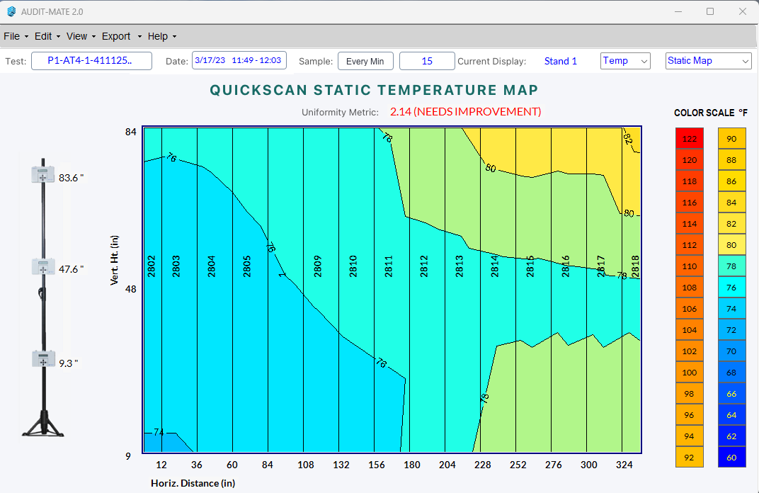
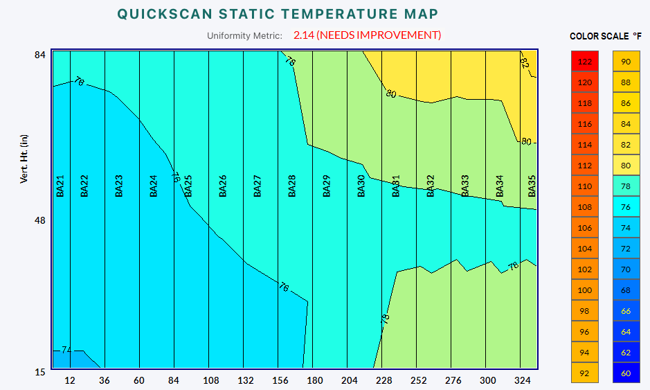
Example of a Thermal Heat Map
The Thermal Heat map is a tool used by Data Center Operations teams to visualize the airflow and temperature stratification within the aisles of the data center. By taking the raw data numbers collected during the thermal scanning of an aisle of rack, and displaying them as a colorized image. Using this image a number of issues can be identified, such as cold spots and hot spots. Or the image can be used to validate a CFD model that predicted performance. The Thermal Heat Map may even report that everything is exactly as it should be.
Who
So who would be interested in having a Thermal Heat Map of their data center aisles? Any, and perhaps, every Operations Manager should be interested in the condition of the cooling across the entire data hall. If I am going through Life Cycle changes of servers across the data hall I’d like to know what changes those new servers may be introducing into the data hall. If I am implementing a containment solution in the data hall, taking before and after readings can validate and quantify the effectiveness of the program. If I am upgrading and/or replacing the CRACs or CRAHs in the data hall how did this change the airflow and temperatures. I recommend every aisle should be checked at least once a year, if not semi-annually, and whenever a major change for the space is planned.
What
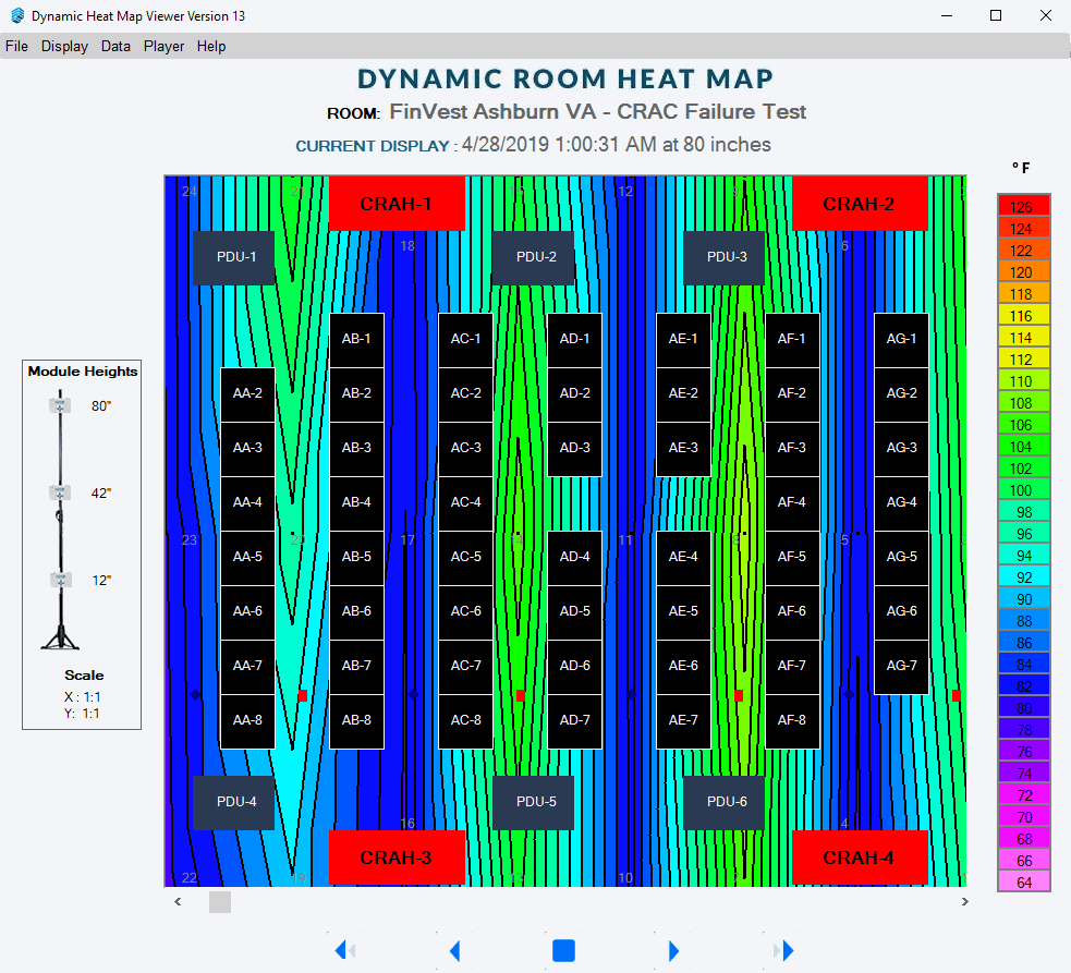
So how does one generate a thermal heat map? Using our Purkay Labs AUDIT-BUDDY tool and AUDIT-MATE software, we collect temperature and humidity samples, at three rack elevations, for every rack in the aisle. The software takes those data points and displays them as a colorized representation of the aisle. The software also reports the data as raw numbers for every sample. Similar maps are created for the Humidity readings as well as the Dew Point calculations.
The two modes of operation are the quickscan where every rack gets a one minute sample taken and the resulting Thermal heat map represents the readings that were recorded. The Long Scan is where a sensor stand is left stationary in one location and one minute samples are taken over a predefined period of time and the resulting data is graphed on the timeline to reflect the variations that correlate to time of day activities or loads
Where
Data Centers are the primary focus of the Thermal Heat Maps.
However, any Laboratory,
Growing location,
Hospital.
Anywhere temperature and humidity controls are very specific and need close attention paid to them, are candidates for our services.
Being a temporary, portable tool it can be rapidly deployed, most anywhere, and collect the data needed, allowing for data based decisions to be made regarding remedial actions to be taken.
When
The thermal heat map is a valuable tool before and after implementing changes within the data hall.
Periodic sampling provides a history against which to compare current readings.
Due to the constant change within the data center we recommend semi-annual thermal scans which can detect subtle changes in temperature across a data hall and allow adjustments to be made before a subtle change becomes a big problem.
Data Center infrastructure components have fixed Preventative Maintenance inspections and checks to detect anomalies and assure equipment is performing optimally. No one ever thinks not to perform the UPS, CRAC, Condenser, Dry Cooler, Pump maintenance routines. PDUs and RPPs receive thermal scans to detect faulty wiring connections or faulty circuit breakers. Data Center airflow should be no different. Hence a regularly scheduled maintenance would include a thermal scan and a comparison to the previous scan’s results.
Why
Data Centers are not static environments. Servers come and servers go. The load in one area may increase while the load in another area may decrease.
Few data centers have an adequate deployment of sensors across the entire data hall to capture the subtle changes that take place, yet those changes can have a profound impact on server operations. Certainly AI with its GPU heavy servers drawing more power, thus generating more heat, can disrupt the balance of airflow in an aisle, or even an entire data center.
If I were planning on implementing a containment solution I’d certainly want to know the effectiveness of the containment. First I would take a baseline reading of the data hall to document my starting point. Once the containment implementation is completed I would take a second baseline for comparison to the first. Am I now overcooling any aisle? Are there still hot spots to research for their root cause? Any change program should have a means of feedback to validate its effectiveness and the visual representation is easy for non-technical people to understand.
Using the data collected one can make informed decisions concerning airflow, set points, and server deployment locations within the data hall.
If I were experiencing reports of Hot Spots in the data hall the tool can quickly record what is happening and provide very specific data on Temperature, Humidity and Dew Point. Thus allowing for targeted remedial actions to be taken.
In conclusion, a thermal heat map of the Data Center can assure operations staff that appropriate temperatures are being supplied, no unintentional hot spots, or cold spots exist. You can learn more here: https://www.purkaylabs.com/assessment-service
Purkay Labs offers Assessment Services to perform the baseline assessment for you. Our service includes an aisle by aisle, or cage by cage summary report, a viewer program where one can click on a specific aisle and view the data collected. Or you may study the static heat maps that depict the temperature stratifications across the face of the aisle. Another option is to rent or purchase the AUDIT-BUDDY System and perform the work yourself.
About the Author

Gregg Haley is a data center and telecommunications executive with more than 30 years of leadership experience. Most recently served as the Senior Director of Data Center Operations - Global for Limelight Networks. Gregg provides data center assessment and optimization reviews showing businesses how to reduce operating expenses by identifying energy conservation opportunities. Through infrastructure optimization energy expenses can be reduced by 10% to 30%.
In addition to Gregg's data center efforts, he has a certification from the Disaster Recovery Institute International (DRII) as Business Continuity Planner. In November of 2005, Gregg was a founding member and Treasurer of the Association of Contingency Planners - Greater Boston Chapter, a non-profit industry association dedicated to the promotion and education of Business Continuity Planning. Gregg had served on the chapter's Board of Directors for the first four years. Gregg is also a past member of the American Society of Industrial Security (ASIS).
Gregg currently serves as the Principal Consultant for Purkay Labs.
Want to Learn More on Diagnostics?
Check out these other Keep your Cool Articles or visit our learning resources page.